Category Archives: Dynamics-CRM

Warnings for appointments

Appointments play an essential role in the visit plan calculation. Accordingly, their data quality is important. portatour® now displays a red message in the main menu if there are warnings for future appointments. Appointments from calendar subscriptions are also taken into account.

Click to go to the list of affected appointments. Open the detailed view of this appointment to see the respective warning message in red font. We recommend a prompt elimination of the causes to ensure a high quality of schedules.

Extended search with relative date filters

The extended search now also supports relative values in the filtering of date fields.
Example: “customers, for which the last visit date is in the last 7 days.”

Relative filters allow you to reuse saved searches with date filters without having to adjust them every time you use them.

How to use relative date filters:

  1. Open an extended search.
  2. In the user-defined filter in the first selection box, select a date field. This gives the second selection box additional relative filter options.
  3. In the second selection box, select the desired relative filter (e.g. “last X days + today”).
  4. If the filter contains an “X” as a placeholder, enter the desired numerical value (e.g. 7) in the input field next to it.
  5. Click on “Apply“.

Maps receive improved print mode

Proceed as follows to use the new print mode for printouts or PDF export:

  1. Open a map view.
  2. Click on the cogwheel at the top right.
  3. Switch to “Print mode: on“.
  4. Select format and alignment.
  5. You will see the map preview in the selected format, on which you can continue to zoom and move. The legend can also be expanded and collapsed.
  6. Optionally, enter a title that should appear on the printout.
  7. Click “Print“.
  8. Tip: In the following printer dialog remove the margins to avoid unnecessary page breaks.

To exit print mode, switch to “Print mode: off“.

Territory optimization: map gets new display modes

This news concerns administrators and supervisors of company accounts with activated territory optimization.

The new display modes are available in every map of territory optimization and are suitable tools if you prefer manual optimization of areas instead of automatic optimization.

Click on the cogwheel at the top right. In the selection field “Display” you will find three new entries: beeline, distance zones and driving routes.

Note: In these display modes, the customers are automatically hidden so as not to cover the lines. To additionally show the customers, click on “customers: Show all” on the cogwheel.

Beeline

For each employee, direct connecting lines are drawn between home location and all of its customers.

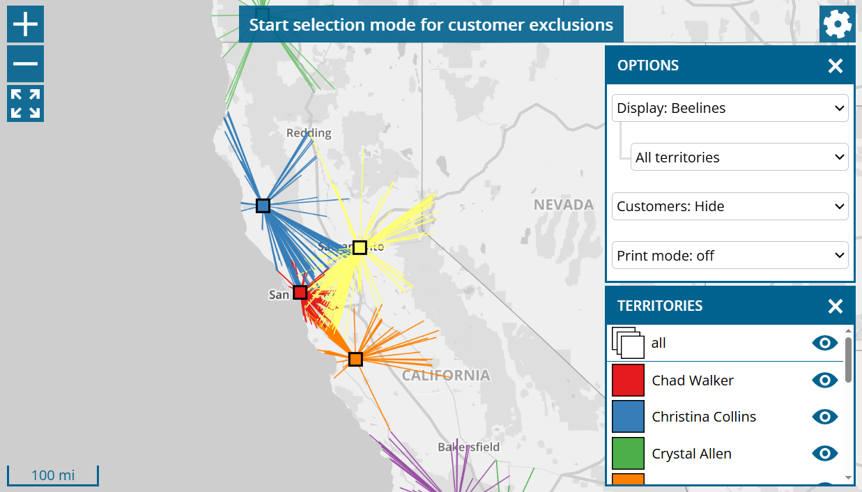
An intersection with the lines of another area can be an indication that customer assignment is in need of improvement. However, we recommend using the more modern route display to analyze the situation correctly.

Distance zones

The distance zones provides information on how long your employees have to travel to reach the individual regions of your sales area.

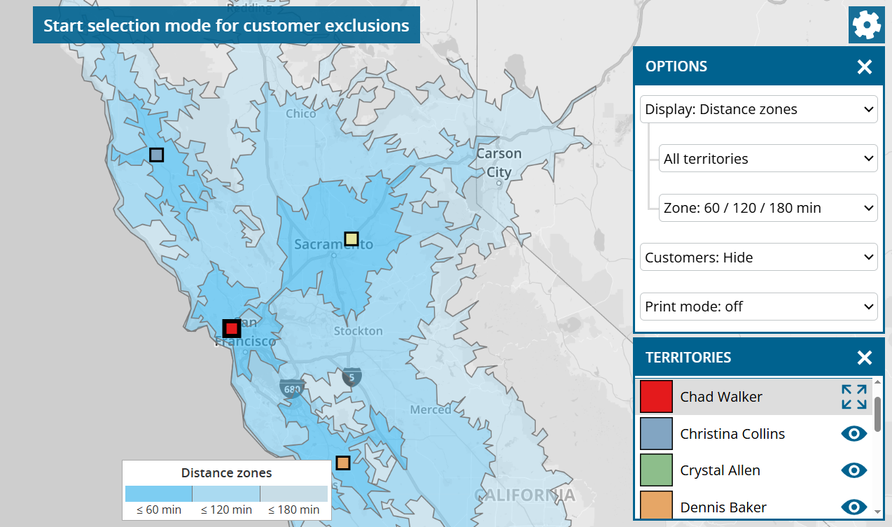
Light or non-colored regions indicate that the support of customers is associated with more driving time there. However, to analyze the situation correctly, we recommend color of customers after driving time.

By default, the system is divided into the following three zones, which are displayed in different shades of blue: up to 60 minutes driving time, up to 120 minutes driving time and up to 180 minutes driving time. To change the distance zones, use the “zone” selection box by the cogwheel.

The distance zone for a region is determined based on the nearest employee. If you only want to determine the distance zones based on one employee, switch from “All territories” to the desired region.

Routes

In “Routes” display mode, there are two options for Selection: “Routes from home location” and “Typical routes“.

Due to the complexity of the calculation, this display cannot be performed simultaneously for all territories. Select the area to be analyzed using the cogwheel.

Routes from home location

All routes are displayed, which the employee must drive from his home location in order to reach each of his customers, which has entered a call interval, directly in the fastest way.

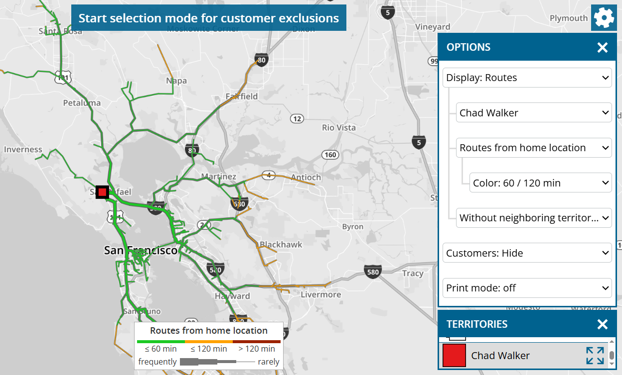
The green/orange/red color of driving distance indicates how long it takes to get there. You can use the cogwheel to change the limits for this color.

The thickness of the route indicates how frequently a road must be used to reach all customers.
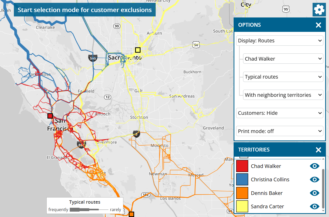
Typical routes

This display is similar to “Routes from home location”, whereby the routes between adjacent customers are also visualized.

This illustration provides a good insight into which roads the employee is likely to drive on and how often on his tours in order to visit his assigned customers in the desired call interval.

If you wish, you can switch to “With neighboring territories” to see any overlaps in routes between employees. These overlaps are an indicator that there is potential for optimization.

Single sign-on in combination with Microsoft Dynamics CRM Online

This news concerns administrators of company accounts with the data source system Microsoft Dynamics CRM Online (not on-premise).

To allow your users to log in to portatour® Anywhere with the Microsoft single sign-on provider of your Dynamics CRM Online, proceed as follows:

  1. Install the latest version of portatour® for Dynamics® 365 v9.0: Download
  2. In Microsoft Dynamics, open “portatour® > Administration > Overview > Organization Settings”
  3. On the “General” tab, change “Login Types” from “Username & password only” to “Single sign-on and username & password”.
  4. Save.

The users configured for portatour® can now log in to portatour® Anywhere as follows:

  1. Open the “portatour® Route Planning App” in Microsoft Dynamics.
  2. Click on the large “Open” button in the “portatour® Anywhere” section.
  3. If you were not previously logged in via “Remember me” or you explicitly log out, the login page appears.
  4. Click on “Log in with Microsoft”.
  5. Log in with the Microsoft account that is assigned to your Dynamics.
  6. If the login was successful, you will be automatically logged in to portatour®.

Major December 2024 Update

After an intensive development period, we have released a major update of portatour® today. To read details about the new features, simply scroll down or use the following links:

We wish you lots of fun and success with the new features and look forward to hearing from you at feedback@portatour.com.

Improvements for export and import

This news concerns administrators from company accounts with at least two users.

User export contains all fields

Previously, the user export was limited to the most important user fields. Since this update, the export contains all user fields that can be imported, e.g. also home location and working hours. This applies regardless of whether the export is carried out via the user interface or via API.

No user limit when importing data

If you have previously imported organization-wide data – e.g. customer import, then a maximum of 100 users could be affected by this process. This limit has been removed. However, the limits for file size (30MB) and number of data records (100,000) of the imported file still apply.

Territory optimization: Display areas, area names and key figures on map

This news concerns administrators and supervisors of company accounts with activated territory optimization.

The display of the territory surfaces is available in each map of the territory optimization.

Click on the cogwheel at the top right and switch to “Display: Customers + areas” or “Display: Areas”.

portatour® uses zip code boundaries when coloring areas. If there are several customers of several users in one zip code, it is assigned to the user that has the most customers there.

Depending on the space available, the area name is displayed complete or abbreviated.

Selectable key figures can be displayed below the area name. The number of customers in the area is displayed by default. To display other key figures, proceed as follows:

  1. Click on any territory to select it.
  2. Click again on the territory or on the home location to open the corresponding information bubble.
  3. Click on the eye symbol next to the desired key figure to show or hide it again on the map.

Up to three key figures can be displayed simultaneously.

Territory optimization: New export options

This news concerns administrators and supervisors of company accounts with activated territory optimization.

For many tables in territory optimization, you now have the option of exporting them as an Excel file. To do this, click on the link “Export table / customer data / postal code-user assignment…” below the tables. The following window opens:

Select which data you would like to export:

  • Table: The data displayed in the table is exported with all columns as an Excel file. Use this option if you want to carry out further analyses with the key figures or if you want to save the key figures for documentation purposes.
  • Customer data: All customer data is exported as it is currently valid in the current step of territory optimization. You will also find the columns “Reachable by (source/target) user”. Use these columns to identify geographically distant customers.
  • Postal code-user assignment: Based on the territory areas of the map, the zip codes are exported with the assignment to the users. Each relevant zip code occurs once. If there are customers for more than one user for a zip code, the postal code is assigned to the user that has the most customers there. Use this export, for example, to assign new customers to the correct user in your CRM system based on the zip code.

Territory optimization: Maximum workload adjustable per territory

This news concerns administrators and supervisors of company accounts with activated territory optimization.

If you do not want to load the territories evenly during the optimization, but deliberately differently, proceed as follows:

  1. Go to “Optimization settings > Per territory”.
  2. In the “Workload” column, click on the pen symbol next to the desired territory.
  3. Switch from “Unrestricted” to “Up to …” and enter the percentage value.
  4. Click “Start optimization”.

Use this option, for example, if you want to explicitly exclude an overload in some territories or plan free space for new customers who join later.

Notes:

  • At “Optimization result > Overview”, the “Standard deviation of the workload” can increase in comparison to the initial situation.
  • Do not use this option to map reduced working hours of a user. Instead, enter the new working hours of the affected user under “Manual adjustments > User modifications”.